Web templates determine the overall layout, and feel of your event.
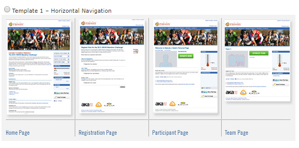
Template 1 – Horizontal Navigation
This template uses a horizontal navigation bar that runs across the top of the header region. The sample image is set to 800 pixels wide and has buttons below the header on the right side.

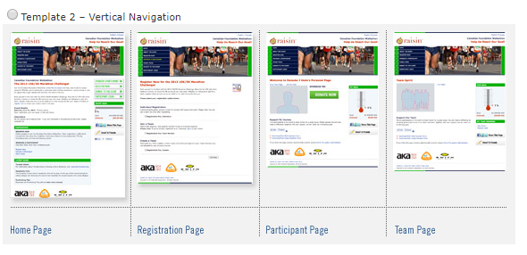
Template 2 – Vertical Navigation
This template uses a vertical navigation bar that runs down the left side in the header region. The sample image is set to 572 pixels wide and has buttons below the header on the right side.

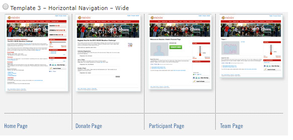
Template 3 – Horizontal Navigation – Wide
This template uses the horizontal navigation across the top of the header region. The sample image is set to 920 pixels wide, there are buttons placed in the header on the event home page and the template has a different colour scheme as a starting point.

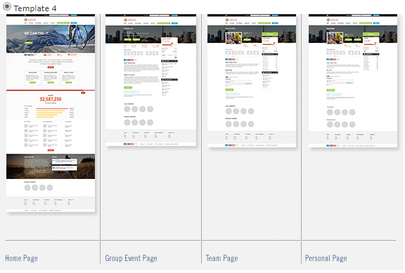
Template 4 - Our Recommended Template
This template uses a horizontal navigation bar that runs across the top of the header region. The sample image is set to 1500 pixels wide and has buttons within the header on the right side. The template follows common practices within most recent web design principles. This template also has a more modern look and feel, which is why we recommend this over the other three.

Switching Templates
Given the different layouts, templates contain unique regions. When switching templates, content will disappear and/or change. Be sure to save your work external to raisin before changing templates.
