Supporters and their expectations are changing, and responding to these trends relies on meaningful data. But being data-driven isn't easy — but especially when you don’t have the luxury of time to be searching for trends running around in Excel to understand it, or waiting for the data to percolate into an aging, third-party tool.
Analytics is our next generation of reporting, dashboards and supporter intelligence, getting you sharper insights and faster. With key dashboards fundraising metrics, trends and charts that are interpretable and actionable, a brand new set of pre-built reports and flexibility to dive deeper across all of it to find answers to questions that unlock your full fundraising potential.
Analytics is the first phase in the evolution of our re-designed administrative console.
Getting started
Analytics will report on all of your Campaigns (events) and their related activity, and is accessible from your administrative console by clicking the Analytics icon (![]() ) in the navigation.
) in the navigation.
How does it work?
On click, your Organization Dashboard will launch, running calculations as it loads. The Organization Dashboard will surface key figures, charts and lists that pertain to all of your live campaigns with fundraising activity in the last year. Data is up-to-date to the last hour.
To find your way around, use the chart and legend below. These options will cascade across your Analytics experience.
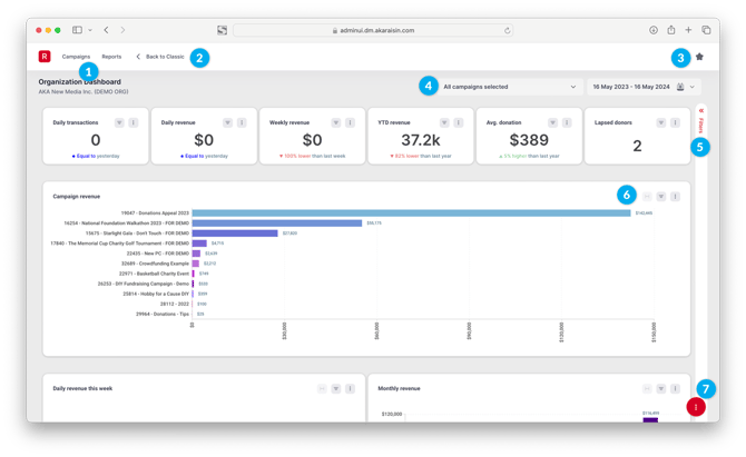
1. Main navigation
The main navigation allows you to move section-to-section in Analytics:
- "R" home icon: Returns you home to the Organization Dashboard.
- Campaigns: Browse or search a Campaign List of campaigns you have access to, with the ability to drill down for contextual figures, charts and lists in a Campaign Dashboard.
- Reports: Lists more detailed Reports in your account.
More sections will be added over time.
2. Back to Classic
Return to the Classic administrative panel for all other aspects of account, campaign and user management. You can always head back into Analytics by clicking the Analytics icon in the classic navigation.
3. Utility navigation
The utility navigation performs a few functional tasks:
- Favourites: View a feed of your favourited Campaigns, Reports or Contacts, and quickly access them.
- Support: Request support from our HelpDesk or access help resources from the Knowledge Base (where you are now!)
4. Quick Filters
Dashboards and reports can be filtered in numerous ways (see Filters below). We've raised a few filters here for quick actions:
- Campaigns: Select one or multiple campaigns to view data on
- Date: Choose your time series
In Reports, you'll also see contextual sub-Filters for data points like Transaction Status and Payment Method.
5. Filters
Use Filters to slice data in the view across one or many fields. Filters can be applied to fields within the Dataset(s) that the view uses.
For example, let's say on the Organization Dashboard you want to see just activity campaigns with your Campaign Code of "EVENTS". Use the Filter selection and click "Add Filter" to scroll or search for the Campaign Code field. Select "EVENTS" for your list of Campaign Codes and select Apply.
Find out more on Filters in this article that details the various ways filters can be applied and how it affects your data.
When filters are specified, a pink indicator (dot) will appear on the chart noting that a filter is affecting it. As filters apply only to charts and reports that use the same data set, this indicator is a helpful reminder when analyzing data with filters.

6. Charts, reports and related settings
In the view are of course the charts, reports and metrics that help you analyze your campaigns and gain deeper insight into your fundraising.
By default, Dashboards and Reports are designed to present data that's most relevant to the Campaign Type (i.e. Module) and Contacts (i.e. constituents) at hand, and in turn, will draw from specific datasets. Layouts and data will differ for each.
For example, your Organization Dashboard features Key Performance Indicators (KPIs) and charts across different common fundraising activities on raisin, like campaign comparisons, breakdowns on sources of revenue and who your new donors are; whereas the Participants Report is focused on events/event fundraising with a set of KPIs for number of fundraising goals achieved, donations per participant and number of $0 fundraisers, and a table that reports on participants' progress.
Charts in the view allow for further interaction and specification by performing any of these actions:
- Hover: Hovering over the chart will display descriptive stats, like Counts, Averages, Medians.
- Drill Down: Clicking data on a chart allows for further analysis.
- Settings: In addition to the filter indicator that's described above, each Chart has its own settings that enable you to set chart-specific Filters, resize (Fit to Panel), and select the Columns that display.
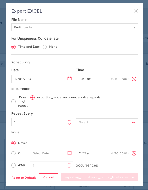
- Download: Download a copy of the chart in one of the available formats.
7. Personalization
Personalization allows you to customize the layout of view and the data within it. Think of it as re-designing the Dashboards, Charts and Reports we give you to make Analytics your perfect, personalized home. Everything from the Charts that appear in the view, the columns of data that appear in a chart, how data is visualized and even names of fields are within your control.
For example:
Analytics with Personalization is available to clients with subscriptions to Growth and Bloom, or equivalent packages. Contact your Client Experience Manager to find out your eligibility.
Select the icon with three dots to open up actions available to you in Personalization mode:
- Edit Dashboard / Report:
- Layout: Modify Summary Panels and Charts in your view and how they appear, including position and size. You can also add more data from a library of Summary Panels and Charts that we've created from you by dragging them into view.
- Charts: Customize the data, columns and style of a chart so that it best suits you.
- Download: Download a copy in the formats listed immediately, or hit "Schedule" to queue the report for download in the future and/or a recurring basis.
- Save: Save the changes you've made. The updates affect just your view - not those across your organization.
Personalization truly puts the data in your hands. While there's a summary below, we encourage you to go deep on Personalization in this detailed article to explores the ways...
Editing the Dashboard / Report Layout
Once Personalization mode has been activated, your dashboard will become an editable canvas that's organized as a grid.
Clicking any chart will highlight it in light blue, allowing you to Move (⋮) by selecting the three vertical dots in the top left-corner, the chart will become draggable, Delete (x) the chart entirely and/or change its Size (⇲) with any of points along the border to re-size like you would an image. The chart will snap to grid.
A Data panel will also slide open from the right. Here, you can search and select from Summary Panels and Charts in your library so that the view is surfacing what matters most to you.
Editing a Chart / Report
Individual Charts and Reports offer a similar level of flexibility in Personalization mode.
To edit a chart, click the settings icon (⋮) in the top-right corner. This will open up a Chart Builder, where you can modify Data -- using Categories and Values in the dataset -- by dragging the columns into the Category, Value or Group shelves in the order want to analyze them, use the Canvas below to modify column headers and data attributes, and on the far right-hand side, select from various Configuration options that customize how the chart type and appearance.
Save your changes to modify the Chart. Your updates will publish to the Dashboard after you save the Dashboard in full on the next screen.
Subscribing to Reports & Dashboards
Personalization mode also provides access to schedule Dashboards and Reports, allowing you and your team to receive insights about your Organization or a specific Campaign(s) directly to your inbox at a frequency of your choosing. This supplements the ability to schedule downloads directly from Reports, as noted above.
To do so, from any Report or Dashboard, click the three dots in the bottom right corner to launch personalization. Select the Bell Icon and choose Subscribe to a Dashboard. This will launch the Dashboard Subscription screen, where you can:
- Enter a "Name" for the Subscription that will be visible in raisin, in case you need to manage it later
- Select the Dashboard you wish to receive updates on, specific Charts on the Dashboard and how it should be exported
- Choose your repeating schedule, including a Start and End
- Enter the email addresses of individuals you'd like to subscribe to the insights
- Compose the email the exported data will be attached to
Here's a short demonstration:
The same steps can be taken across any Dashboard on your account.