Personalization mode is one of the most powerful features in Analytics. Personalization puts your data in your hands, giving you the flexibility to customize the layout of view and the data within it, so that charts, reports and dashboards surface what matters most to you and in formats that best suit your needs.
Think of it as designing Analytics into your perfect, personalized home with everything from the Charts that appear in the view, the columns of data that appear in a chart, how data is visualized and even names of fields being up to you.
Personalization is available to clients with subscriptions to Growth and Bloom, or equivalent packages. Contact your Client Experience Manager to find out your eligibility.
Personalization can be applied to the following views in your your administrative account:
- Dashboards
- Charts
- Reports
The changes you make are specific to your account, and will not affect what others in your organization are up to you. You can also revert the changes that you made to a dashboard to see the default content created and later jump back to your personalized version at any given moment.
Get started personalizing
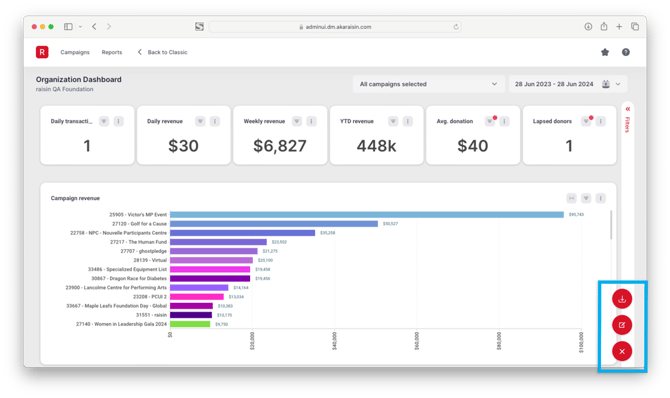
To start personalizing a view, look for the red icon with three dots (![]() ) in the bottom right-hand corner of the screen.
) in the bottom right-hand corner of the screen.
Clicking the Personalization icon will open up the following actions:
- Edit Dashboard: Allows for modifications to Summary Panels and Charts in your view and how they appear, including position and size. You can add or remove data from a library of Summary Panels and Charts that we've created for you by dragging them into view.
- Editing a Chart / Report: Customize at the level of individual Charts and/or Reports, changing chart types, categories and data, field names and even styles.
- Download: Download a copy of the Dashboard/Report in the formats listed.
- Save: In order to save your changes, be sure to click "Save" before exiting personalization mode.
The same Personalization Mode icon will appear across views (Organization Dashboard, Campaign Dashboards and Reports). While the icon is the same, when activated and you're personalizing, edits are applied just to the view that you're in. For example, personalizing the Organization Dashboard will not change charts in your Campaign Dashboard, or further in the Transactions Report.
Adding, removing and positioning charts on the Dashboard
When Personalization Mode is active, you can move panels around, resize them, remove any chart from the page, or choose other Charts from under any dataset to add to the page.
Adding charts
The Data panel on the right-hand side contains a library of charts, lists and stats, organized by Dataset, that can be dragged into your view:
- Search for a Panel or Chart or browse through the Datasets to find a report that suits you. Hovering over the chart will show a brief description of the chart and its type (e.g. Bar Chart, Indicator, Pie Chart).
- Select and hold the chart, and drag into the view
We recommend scrolling to the location on the dashboard you want to position the chart at before dragging and dropping it in. It will make arranging the chart easier.
- Position the chart into the grid and release ("drop") it to the desired location
Positioning charts
Any chart can be re-organized in the layout. Clicking on a chart in Personalization Mode allows you to re-arrange and re-size it:
- In the top-left corner, click and hold the 6 dots (⋮⋮) to drag and drop the chart where you'd like it to go on the grid
Dragging the chart into an area where another chart already sits will replace the latter, moving it to an adjacent position on the grid.
- To re-size, use the directional arrows along the borders. Hold your mouse button down and drag left or right to increase or decrease the size in any direction. The chart will snap to the closest point on the grid.
- To remove a chart, simply select the "x" in the top right corner of the chart
Personalizing a Chart / Report
More than just personalizing layout, Personalization Mode allows you to completely modify the Charts and Reports we've provided using a Chart Builder, so that they surface the data most salient to you, in and a manner that's most understandable.
For instance, let's say you want to add a new field to a table that separates the Dollar Amount of Admin Fees a supporter opted to cover and rename a field in the chart and change the order of the Report and modify the format of a Transaction Date, and then summarize the results by the Fund Name each supporter gave to... well, you can do all of this with the Chart Builder.
Using the Chart Builder, you can perform the following actions:
- Add, reorder and remove fields (Categories and Values) from the Dataset(s)
- Group/summarize results by fields
- Re-name, sort and format data
- Choose/change the type of chart
- Style and re-configure the chart's appearance
To get started personalizing, simply click on the dotted setting menu icon (⋮) at the corner of the chart panel to find and click on the Edit option.
The Chart Builder consists of five panels, depicted in the legend below:
 1. Data Panel
Data fields from the selected Dataset(s) are listed in this panel and can be browsed or searched. The data fields are divided into Categories and Values and their data type is presented with an icon next to each. Hovering over each field reveals more details about these attributes.
Drag and drop the fields into the Column Shelf and/or Canvas to be analyzed in your chart. As you drag fields in, the chart will update in real-time.
2. Adding fields to the Column Shelf
You can drag and drop the data that you want to analyze to the fields in this Column Shelf, as demonstrated above. The number of fields in the shelf and their expected data types vary from chart type-to-chart type.
Data fields can also be dragged to re-order within this shelf, moved to other data types or returned the Data library using by selecting the six-dot icon.
Data field options
Each column pill offers additional options (⋮) for the field in it, like changing its data format, aggregation, sorting, calculation and trend lines.
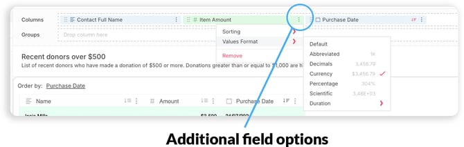
The additional options available differ depending on the data field type and the type of chart you've selected:
| Field type | Value type | Options |
| Category | Text | Sort (Ascending or Descending), Remove |
| Numeric | Sort (Ascending or Descending), Discrete, Continuous, Remove | |
| Date | Sort (Ascending or Descending), Date group (Year; Quarter, Year; Month, Year; Week, Year; Full Date; Quarter; Month; Day, Month), Format (MM/DD/YYYY, MM/DD,YYYY HH:MM:SS, Custom), Discrete, Continuous, Remove | |
| Value | Text | Sort (Ascending or Descending), Aggregation (Sum, Average, Median, Count, Distinct Count, Minimum, Maximum), Table Calculations (Running Average, Running Sum, Running Min, Running Max, Difference, %difference), Values Format (Abbreviated, Decimals, Currency, Percentage, Scientific), Remove |
| Date | Sort (Ascending, Descending), Aggregation (Count, Distinct Count), Values Format (Abbreviated, Decimals, Currency, Percentage, Scientific), Remove |
3. Canvas
The Canvas is where your chart will be previewed and where you drag and drop data fields for analysis and/or where you cdd/change the name and description of fields and/or the chart.
4. Configuration Panel
This panel consists of two major sections: The Charts panel, where you can choose the type of chart you’ll be using, and the Chart Configuration section, from where you can apply different settings to configure
5. Toolbar
A quick way to add buckets, formulas, filters, change the color of the visualization, and save your work, among other quick actions.