What is System Content?
System content is dynamic content that displays only on the front-end based on event selections or system-generated content.
While working in the CMS, that there are certain areas of your event that you cannot directly edit and appear only as "System Content". These are areas that are generated by the system behind-the-scenes - either from selections you made when setting up the event or from the platform- and then appear on the front facing site.
Some examples of system content are the donation matrix, the participant registration forms, store items, and ticketed items.
While you cannot edit these sections within the CMS, there are two areas where they can be updated.
- The actual structure and content via the backend admin settings
- The look and feel using the design panel and CSS
Backend settings
Building your donations Matrix:
On the Donate page within the CMS, you can control the background image and some content, while the actual donations matrix appears as a grey box labelled 'system content'.
The structure of the donations matrix is setup in two places on the admin portal; the Donation Options tab and the Allocate Funds tab.
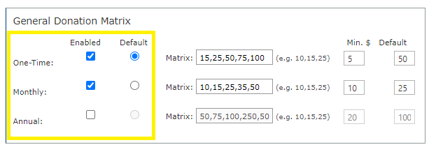
On the Donation Options page, you can edit the tab labels, set their display order using the dropdowns, and enable or disable any of the three donation options using the check boxes (Give Now, Give in Honour, Give in Memory).

Check boxes allow you to set the gift frequency options you would like to have available on your event - one time, monthly, and annual - and set the default option that donors will be prompted with.

This is also where you can set the amounts that appear for donors by entering them in the matrix section and separating each amount with a comma. For example, 10, 25, 50 = $10, $25, $50. Further, you can set the default amount, which is the amount from your matrix that will be pre-selected when someone lands on the page or switches between donation options.

Finally, this is where you can enable the option to allow donors to cover the admin fee by checking the box. You can assign how much will be added to the donation to cover the fee either as a percentage of the donation amount or a fixed dollar amount. Important to remember to update the editable ‘Tool tip’ text to reflect the amounts you've set.

On the Allocate Funds page, you can set the funds that will be available for donors to contribute to. You can choose to include a single fund, a dropdown list of multiple funds, or to hide this selection entirely.
Funds are created on the 'Manage Funds' tab of the 'General Setup' page. Funds created on this page will populate on the 'Allocate Funds' page. To set the funds that will be available to donors, use the 'Select' check boxes to select the funds to include and click the 'Add to Selected Funds' button.
To hide the funds selection dropdown from the front end site, check the 'Hide Funds Selection' check box.

Donations, Registration, and Ticketing forms
The forms that your constituents fill out to donate, register to participate, or purchase tickets for an event will also appear as grey 'system content' boxes in the CMS. Across all three modules, these forms are generated from the 'User Profile Fields' tab in the admin portal. From the available list of fields, you can indicate which fields you would like to have as mandatory, optional, or hidden all together.
Fields that are shown in a dark grey row with a red asterisk are required by the raisin platform and will always be included on the user profile forms as mandatory fields.
Begin by selecting the user profile form that you want to edit from the dropdown. Then use the radio buttons to indicate which fields should be hidden, shown, or shown and mandatory

You can also leverage the custom fields to build your own questions. You have 5 available fields where you can ask constituents additional questions not found on the above list and allow answers to be given in the form of an open text box, or from a dropdown list you create.
Enter your question in the fillable field and use the TextBox link to indicate if the response should be a fillable text box field or a dropdown option. A lightbox will prompt you to select a response type and enter response options if applicable.

For Ticketed or Pledge events, you can add further additional questions to the form using survey questions. For more information about creating surveys, see How do I create survey questions?
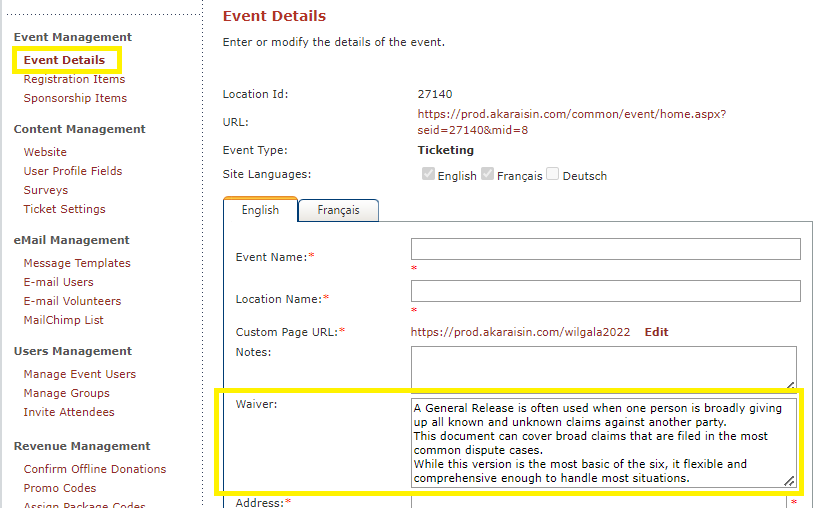
For Ticketed or Pledge events, you can also include a waiver that must be checked off in order to register or purchase a ticket. These waivers can be added in the admin portal on the Event Details Page.

Registration and Store Items
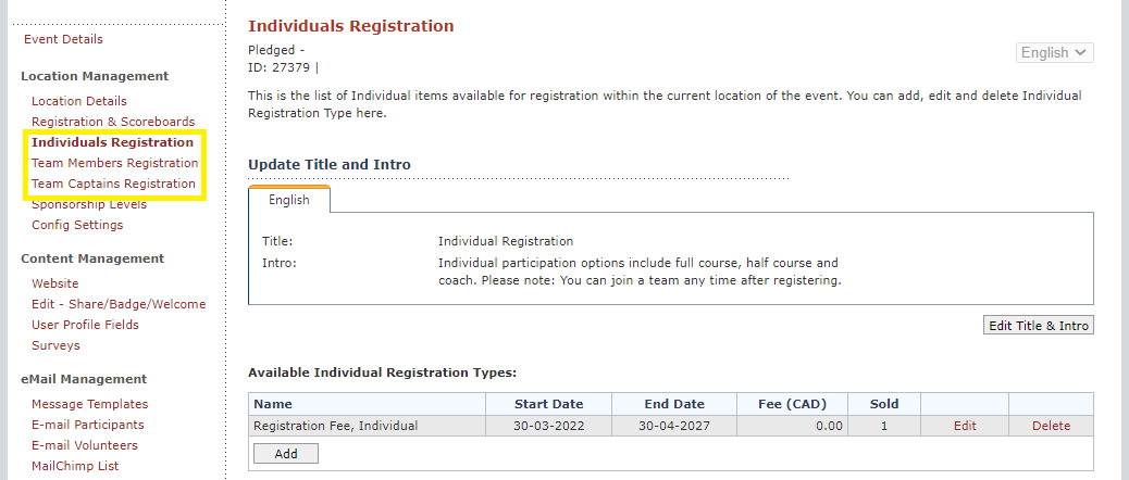
For both Pledge and Multi-Pledge events, the different registration items will appear as grey system content blocks in the CMS. These are pulled from the registration items that have been setup on three separate pages in admin: Individual Registration, Team Member Registration, and Team Captain Registration.

For Multi-Pledge events, the first ‘group’ selection is set up in two places; assigning the label in Event Details (Singular and Plural) and adding groups in the Manage Groups page (ie. Mange Cities, Manage Provinces, Mange Schools)

Store Items can be built on the 'Store Items' page of the admin portal. Not only can you add items here, you can include images for each item, as well as determine their order.
For more information about store items see How do I create/add Store Items?
Tickets and Sponsorships
For ticketing events, the available tickets and sponsorships options will appear as grey system content blocks in the CMS. These items are set on the Registration Items, and Sponsorship Items page. Much like store items in pledge, you can also add images which will appear on the front facing site, as well as select the order you would like them to appear.
For more information about registration and sponsorship items for ticketed events see How do I created registration or sponsorship items for Ticketed events?
Design Panel and CSS
Now that we have set up all of our system content on the back end, we can add some styling in the CMS, specifically using the design panel.
Because all of these system content areas are part of the user flow, you can add styling to the buttons. Button Style will allow you to determine the first button a constituent will hit when starting the flow. You can assign things like colour, font, and font size here. The Flow Button Style allows you the same design features, but these will be the buttons that bring users from one step of the flow to the next.

There are additional changes that can be made by injecting custom CSS into the panel at the bottom of the design tab, but if you’re curious to see what’s possible, see What if I want to style something not available in the Design Panel? or contact your Account Manager.